Choosing color for Boulder light.
Thin air, sandstone bounce and four months of snow glare. Colors behave differently here, and sampling the way everyone tells you to is why so many go wrong.
- Twelve colors that work in Boulder light
- Sherwin-Williams, PPG and Benjamin Moore
- Which pigments fade fastest at altitude
- Historic district palette guidance
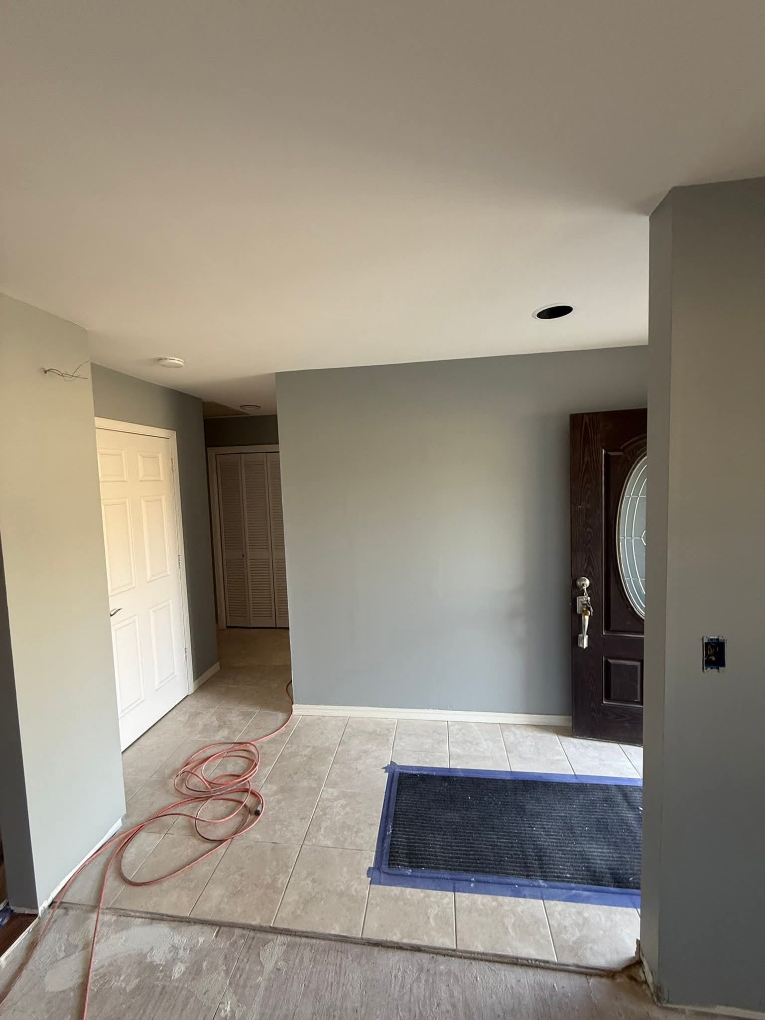
Paint color reads differently in Boulder because of three local conditions: the thinner atmosphere at 5,430 feet produces harder, higher-contrast light; the Flatirons reflect warm sandstone-toned light onto west-facing walls while open sky throws cool light on east-facing walls; and winter snow reflects a large amount of cool light onto lower walls and into interior rooms. Saturated reds and yellows fade fastest under high-altitude ultraviolet, while earth tones, whites and grays hold longest. Sample on movable boards on every elevation before committing.
Why your color looks different here
Boulder sits at 5,430 feet with the Flatirons directly west. Three things follow, and together they explain why a color that looked perfect on a chip in the store looks wrong on the wall.
- Thinner atmosphere, harder light. Less scattering means more contrast, crisper shadows, and colors reading a half-step lighter and more intense outdoors than they do on a chip.
- Reflected light from the foothills. West-facing walls catch warm bounce off sandstone in late afternoon. East-facing walls get cool morning light off open sky. The same gray reads warm on one wall and blue on the other.
- Snow changes everything for months. Fresh snow throws a huge amount of cool reflected light onto lower walls and interior rooms. A color chosen in July can feel completely different in January.
Sample properly, or do not bother
- Paint boards, not walls. A two-foot square of poster board with two coats, so you can move it.
- Put one on each elevation. North, south, east and west genuinely differ here.
- Look at it at three times: morning, mid-afternoon, and dusk.
- Leave it up for several days. First impressions of color are unreliable.
- Hold it against the fixed elements: roof, stone, brick, window frames. Those are not changing.
What fades fastest at altitude
Saturated reds and bright yellows are the most vulnerable, because the organic pigments that produce them break down under ultraviolet faster than inorganic pigments do. Deep blues and greens sit in the middle. Earth tones, whites and grays hold longest, which is part of why the Front Range vernacular leans that direction.
If you want a saturated accent, put it somewhere protected, like a recessed entry door under a porch roof, rather than on a south-facing garage door.
If you are in a historic district
Mapleton Hill and Whittier properties go through Landmarks review for exterior color. Period-appropriate palettes matter there, and the review is substantive. The good news is that the evidence for your home's original scheme usually still exists on the building, in protected spots under downspouts or inside porch cavities. See our historic home page for how that process runs.
Colors we specify often in Boulder
Screen colors are approximations. Always sample the real product on your own wall.
Color questions
Why does my paint color look different outside than on the chip?
What colors last longest in Colorado sun?
Can I use any color in a historic district?
Do you help with color selection?
What about HOA palettes in Gunbarrel or Superior?
Should trim be lighter or darker than the body?
Get a written estimate
Send photos and we will price it without a visit where we can. Peeling, water damage or a landmark property gets a walkthrough first.
Every estimate names the surfaces, the preparation steps, the exact product line and sheen, the coat count, the schedule and the warranty. Nothing vague.
Prefer to talk? 720-208-5645, seven days.